Data Visualization
목차
- Hello, Seaborn
- 선도표(Line Charts)
- 막대 차트(Bar Charts)와 히트맵(Heatmaps)
- 산점도(Scatter Plots)
- 확률 분포(Distributions)
Hello, Seaborn
이 실습 과정에서는 강력하지만 사용하기 쉬운 데이터 시각화 도구인 seaborn을 사용하여 데이터 시각화를 한 단계 업그레이드하는 방법을 배웁니다.
seaborn을 사용하기 위해 Python으로 코드를 작성하는 방법에 대해서도 배웁니다.
각 차트는 짧고 간단한 코드를 사용하므로 다른 많은 데이터 시각화 도구(예: Excel)보다 훨씬 빠르고 쉽게 사용할 수 있습니다.
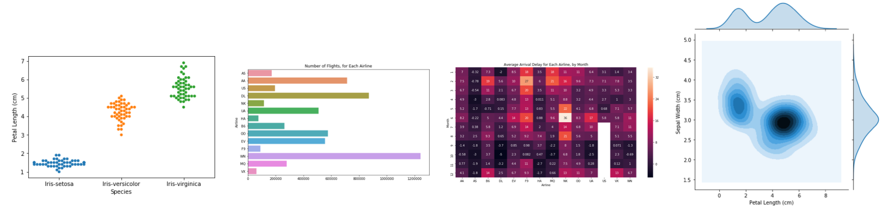
이제부터 만들어볼 차트를 살펴보려면 아래 그림을 확인해보세요.
파이썬 라이브러리 import
1
2
3
4
5
6
import pandas as pd
pd.plotting.register_matplotlib_converters()
import matplotlib.pyplot as plt
%matplotlib inline
import seaborn as sns
print("Setup Complete")
1
Setup Complete
데이터 로드(load)
1
2
3
4
5
# Path of the file to read
fifa_filepath = "input_data/fifa.csv"

# Read the file into a variable fifa_data
fifa_data = pd.read_csv(fifa_filepath, index_col="Date", parse_dates=True)
- fifa_filepath dataset의 파일 경로를 항상 먼저 제공해야합니다.
- index_col=”Date” dataset를 로드 할 때 첫 번째 열의 각 항목이 다른 행을 나타내기를 원합니다. 이를 위해 index_col의 값을 첫 번째 열의 이름(Excel에서 열 때 파일의 A1 셀에 있는 “Date”)으로 설정합니다.
- parse_dates=True 노트북이 각 행 레이블을 날짜로 이해하도록 지시합니다.
데이터 검토
이제 fifa_data의 dataset를 빠르게 살펴보고 올바르게 로드되었는지 확인합니다.
다음과 같이 코드 한 줄을 작성하여 dataset의 처음 5개 행을 인쇄합니다.
1
2
# Print the first 5 rows of the data
fifa_data.head()
데이터 플로팅(plot)
1
2
3
4
5
# Set the width and height of the figure
plt.figure(figsize=(16,6))
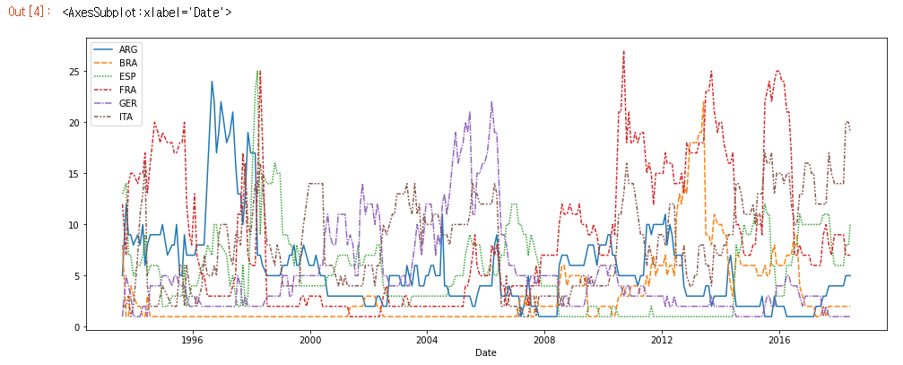
# Line chart showing how FIFA rankings evolved over time
sns.lineplot(data=fifa_data)
선도표(Line Charts)
이 튜토리얼에서는 전문적인 선도표를 만들기에 충분한 Python을 배웁니다. 다음 연습에서는 새로운 기술을 실제 dataset로 작업 할 수 있습니다.
라이브러리 설정 및 데이터 로드
1
2
3
4
5
6
7
8
9
10
11
12
13
14
import pandas as pd
pd.plotting.register_matplotlib_converters()
import matplotlib.pyplot as plt
%matplotlib inline
import seaborn as sns
# Path of the file to read
spotify_filepath = "input_data/spotify.csv"
# Read the file into a variable spotify_data
spotify_data = pd.read_csv(spotify_filepath, index_col="Date", parse_dates=True)
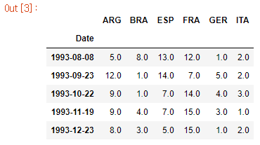
# Print the first 5 rows of the data
spotify_data.head()
1
2
3
4
5
6
7
8
9
            Shape of You  Despacito  ...  HUMBLE.  Unforgettable
Date                                 ...
2017-01-06      12287078        NaN  ...      NaN            NaN
2017-01-07      13190270        NaN  ...      NaN            NaN
2017-01-08      13099919        NaN  ...      NaN            NaN
2017-01-09      14506351        NaN  ...      NaN            NaN
2017-01-10      14275628        NaN  ...      NaN            NaN

[5 rows x 5 columns]
1
2
# Print the last five rows of the data
spotify_data.tail()
1
2
3
4
5
6
7
8
9
            Shape of You  Despacito  ...    HUMBLE.  Unforgettable
Date                                 ...
2018-01-05       4492978  3450315.0  ...  2685857.0      2869783.0
2018-01-06       4416476  3394284.0  ...  2559044.0      2743748.0
2018-01-07       4009104  3020789.0  ...  2350985.0      2441045.0
2018-01-08       4135505  2755266.0  ...  2523265.0      2622693.0
2018-01-09       4168506  2791601.0  ...  2727678.0      2627334.0

[5 rows x 5 columns]
데이터 플로팅
1
2
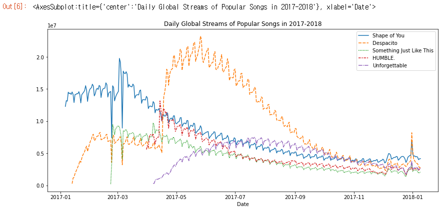
# Line chart showing daily global streams of each song
sns.lineplot(data=spotify_data)
1
2
3
4
5
6
7
8
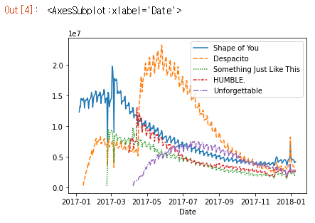
# Set the width and height of the figure
plt.figure(figsize=(14,6))
# Add title
plt.title("Daily Global Streams of Popular Songs in 2017-2018")
# Line chart showing daily global streams of each song
sns.lineplot(data=spotify_data)
코드의 첫 번째 줄은 그림의 크기를 14인치(너비) x 6인치(높이)로 설정합니다.
두 번째 코드 줄은 그림의 제목을 설정합니다. 제목은 항상 따옴표(“…“)로 묶어야합니다.
데이터의 하위 집합 플로팅
지금까지 dataset의 모든 열에 대해 선을 그리는 방법을 배웠습니다. 이 섹션에서는 열의 하위 집합을 그리는 방법에 대해 알아봅니다.
모든 열의 이름을 인쇄하는 것으로 시작합니다. 이 작업은 한 줄의 코드로 수행되며 dataset의 이름(지금의 경우 spotify_data)을 교체하여 모든 dataset에 맞게 조정할 수 있습니다.
1
list(spotify_data.columns)
1
2
3
4
5
['Shape of You',
 'Despacito',
 'Something Just Like This',
 'HUMBLE.',
 'Unforgettable']
1
2
3
4
5
6
7
8
9
10
11
12
13
14
# Set the width and height of the figure
plt.figure(figsize=(14,6))

# Add title
plt.title("Daily Global Streams of Popular Songs in 2017-2018")

# Line chart showing daily global streams of 'Shape of You'
sns.lineplot(data=spotify_data['Shape of You'], label="Shape of You")

# Line chart showing daily global streams of 'Despacito'
sns.lineplot(data=spotify_data['Despacito'], label="Despacito")

# Add label for horizontal axis
plt.xlabel("Date")
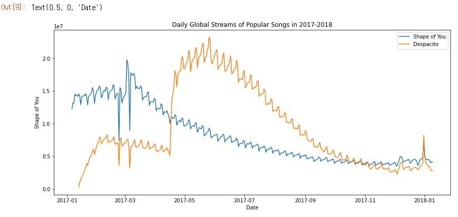
위 코드는 dataset의 ‘Shape of You’, ‘Despacito’ 데이터에 해당하는 선만 플로팅합니다.
막대 차트(Bar Charts)와 히트맵(Heatmaps)
라이브러리 설정 및 데이터 로드
1
2
3
4
5
6
7
8
9
10
11
12
13
14
import pandas as pd
pd.plotting.register_matplotlib_converters()
import matplotlib.pyplot as plt
%matplotlib inline
import seaborn as sns

# Path of the file to read
flight_filepath = "input_data/flight_delays.csv"

# Read the file into a variable flight_data
flight_data = pd.read_csv(flight_filepath, index_col="Month")

# Print the data
flight_data
막대 차트(Bar Charts)
Spirit Airlines (항공사 코드: NK) 항공편의 평균 도착 지연을 월별로 보여주는 막대 차트를 만들고 싶다고 가정 해 보겠습니다.
1
2
3
4
5
6
7
8
9
10
11
# Set the width and height of the figure
plt.figure(figsize=(10,6))

# Add title
plt.title("Average Arrival Delay for Spirit Airlines Flights, by Month")

# Bar chart showing average arrival delay for Spirit Airlines flights by month
sns.barplot(x=flight_data.index, y=flight_data['NK'])

# Add label for vertical axis
plt.ylabel("Arrival delay (in minutes)")
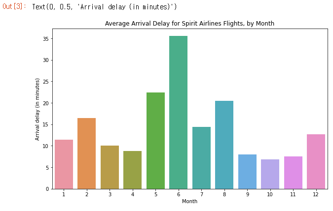
- sns.barplot 이것은 우리가 막대 차트를 만들려고한다는 것을 notebook에 알려줍니다.
- x=flight_data.index 가로축에서 사용할 항목을 결정합니다. 이 경우 행을 인덱싱하는 열(이 경우 months가 포함 된 열)을 선택했습니다.
- y=flight_data[‘NK’] 각 막대의 높이를 결정하는 데 사용할 데이터의 열을 설정합니다. 이 경우 ‘NK’열을 선택합니다.
히트맵(Heatmaps)
아래 코드 셀에서 우리는 flight_data의 패턴을 빠르게 시각화하기위한 히트맵을 생성합니다. 각 셀은 해당 값에 따라 색상으로 구분됩니다.
1
2
3
4
5
6
7
8
9
10
11
# Set the width and height of the figure
plt.figure(figsize=(14,7))

# Add title
plt.title("Average Arrival Delay for Each Airline, by Month")

# Heatmap showing average arrival delay for each airline by month
sns.heatmap(data=flight_data, annot=True)

# Add label for horizontal axis
plt.xlabel("Airline")
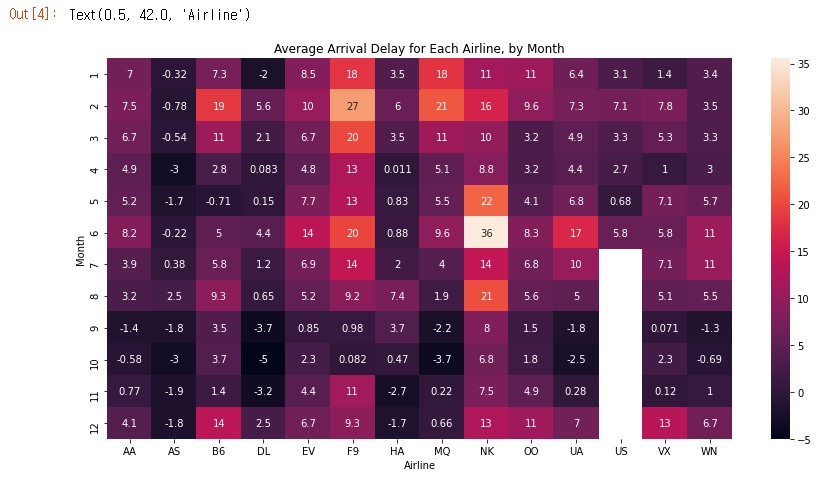
- sns.heatmap 이것은 우리가 히트맵을 만들고 싶다는 것을 notebook에 알려줍니다.
- data=flight_data Notebook이 flight_data의 모든 항목을 사용하여 히트맵을 생성하도록 지시합니다.
- annot=True 각 셀의 값이 차트에 표시되도록합니다.(이것을 False로 하면 각 셀에서 숫자가 제거됩니다!)
테이블에서 어떤 패턴을 감지 할 수 있나요? 예를 들어 자세히 살펴보면 연말(특히 9-11 개월)이 모든 항공사에 대해 상대적으로 어둡게 보입니다. 이것은 항공사가 이 달 동안 일정을 유지하는 데 (평균적으로) 더 낫다는 것을 의미합니다!
산점도(Scatter Plots)
라이브러리 설정 및 데이터 로드
1
2
3
4
5
6
7
8
9
10
11
12
13
import pandas as pd
pd.plotting.register_matplotlib_converters()
import matplotlib.pyplot as plt
%matplotlib inline
import seaborn as sns

# Path of the file to read
insurance_filepath = "input_data/insurance.csv"

# Read the file into a variable insurance_data
insurance_data = pd.read_csv(insurance_filepath)

insurance_data.head()
1
2
3
4
5
6
   age     sex     bmi  children smoker     region      charges
0   19  female  27.900         0    yes  southwest  16884.92400
1   18    male  33.770         1     no  southeast   1725.55230
2   28    male  33.000         3     no  southeast   4449.46200
3   33    male  22.705         0     no  northwest  21984.47061
4   32    male  28.880         0     no  northwest   3866.85520
산점도(Scatter Plots)
1
sns.scatterplot(x=insurance_data['bmi'], y=insurance_data['charges'])
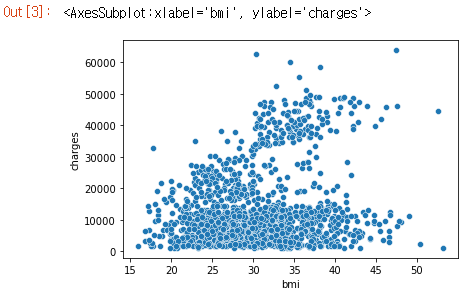
위의 산점도는 체질량 지수(BMI)와 보험료가 양의 상관 관계(positively correlated)가 있음을 시사하며, BMI가 높은 고객은 일반적으로 보험료를 더 많이 지불하는 경향이 있습니다.(높은 BMI는 일반적으로 만성 질환의 위험이 높기 때문에 이 패턴은 의미가 있습니다.)
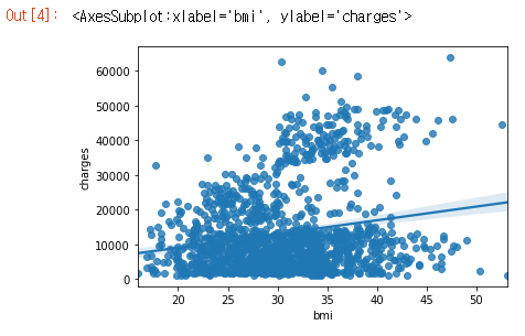
이 관계의 강도를 다시 확인하기 위해 회귀선(regression line) 또는 데이터에 가장 적합한 선을 추가 할 수 있습니다. 명령을 sns.regplot으로 변경하여 이를 수행합니다.
1
sns.regplot(x=insurance_data['bmi'], y=insurance_data['charges'])
색상 코드 산점도(Color-coded scatter plots)
산점도를 사용하여 세 변수 간의 관계도 표시 할 수 있습니다! 이를 수행하는 한 가지 방법은 포인트를 색상으로 구분하는 것입니다.
예를 들어, 흡연이 BMI와 보험 비용 사이의 관계에 어떤 영향을 미치는지 이해하기 위해 ‘smoker’별로 포인트를 색으로 구분하고 축에 다른 두 열(‘bmi’, ‘charges’)을 플로팅 할 수 있습니다.
1
sns.scatterplot(x=insurance_data['bmi'], y=insurance_data['charges'], hue=insurance_data['smoker'])
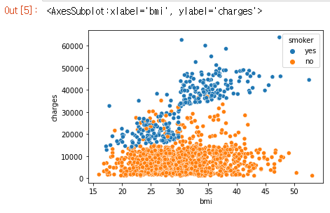
이 산점도는 비흡연자들이 BMI가 증가함에 따라 약간 더 지불하는 경향이 있지만 흡연자들은 훨씬 더 많이 지불한다는 것을 보여줍니다.
이 사실을 더욱 강조하기 위해 sns.lmplot 명령을 사용하여 흡연자와 비흡연자에 해당하는 두 개의 회귀선을 추가 할 수 있습니다. (흡연자에 대한 회귀선은 비흡연자에 대한 선에 비해 훨씬 더 가파른 기울기를 가지고 있음을 알 수 있습니다!)
1
sns.lmplot(x="bmi", y="charges", hue="smoker", data=insurance_data)
위의 sns.lmplot 명령은 지금까지 배운 명령과 약간 다르게 작동합니다.
- insurance_data에서 ‘bmi’열을 선택하기 위해 x=insurance_data[ ‘bmi’]를 설정하는 대신 열 이름만 지정하도록 x=”bmi”를 설정했습니다.
- y=”charges” 및 hue=”smoker”에도 마찬가지입니다.
- data=insurance_data로 dataset를 지정합니다.
마지막으로, 산점도 이외의 플롯이 하나 더 있습니다. 일반적으로 산점도를 사용하여 두 연속 변수(예: “bmi”, “charges”)간의 관계를 강조합니다. 그러나 주축 중 하나에 범주형 변수(예: “smoker”)를 표시하도록 산점도 디자인을 조정할 수 있습니다. 이 플롯 유형을 범주형 산점도(categorical scatter plot)라고하며 sns.swarmplot 명령으로 빌드합니다.
1
2
3
4
sns.swarmplot(
    x=insurance_data['smoker'],
    y=insurance_data['charges']
)
이 플롯을 이용해 아래와 같이 유추할 수 있습니다.
- 평균적으로 비흡연자는 흡연자보다 더 적은 보험료가 청구되며, 가장 많은 보험료를 지불하는 고객은 흡연자입니다. 가장 적게 지불하는 고객은 비흡연자입니다.
확률 분포(Distributions)
라이브러리 설정 및 데이터 로드
1
2
3
4
5
6
7
8
9
10
11
12
13
14
import pandas as pd
pd.plotting.register_matplotlib_converters()
import matplotlib.pyplot as plt
%matplotlib inline
import seaborn as sns

# Path of the file to read
iris_filepath = "input_data/iris.csv"

# Read the file into a variable iris_data
iris_data = pd.read_csv(iris_filepath, index_col="Id")

# Print the first 5 rows of the data
iris_data.head()
1
2
3
4
5
6
7
8
9
    Sepal Length (cm)  Sepal Width (cm)  ...  Petal Width (cm)      Species
Id                                       ...
1                 5.1               3.5  ...               0.2  Iris-setosa
2                 4.9               3.0  ...               0.2  Iris-setosa
3                 4.7               3.2  ...               0.2  Iris-setosa
4                 4.6               3.1  ...               0.2  Iris-setosa
5                 5.0               3.6  ...               0.2  Iris-setosa

[5 rows x 5 columns]
우리는 150개의 꽃, 세 가지 종류의 붓꽃(Iris setosa, Iris versicolor 및 Iris virginica)에서 각각 50개의 dataset로 작업 할 것입니다.
dataset에는 꽃잎의 길이와 너비, 꽃받침의 길이와 너비로 4가지 데이터가 있습니다. 우리는 붓꽃의 종을 추적해볼겁니다.
히스토그램(Histograms)
붓꽃에서 꽃잎 길이가 어떻게 변하는지 보기 위해 히스토그램을 만들고 싶다고 가정해 보겠습니다. sns.distplot 명령으로 이를 수행 할 수 있습니다.
1
2
# Histogram
sns.distplot(a=iris_data['Petal Length (cm)'], kde=False)
두 가지 추가 정보로 명령의 동작을 사용자 정의합니다.
- a=플로팅 할 열을 선택합니다(이 경우 ‘Petal Length (cm)’를 선택).
- kde=False는 히스토그램을 생성 할 때 항상 제공 할 것입니다. 생략하면 약간 다른 플롯이 생성되기 때문입니다.
밀도분포 그래프(Density plot)
다음 유형의 플롯은 커널 밀도 추정(KDE) 플롯입니다. KDE 플롯에 익숙하지 않은 경우 평활화 된 히스토그램(smoothed histogram)으로 생각할 수 있습니다.
KDE 플롯을 만들기 위해 sns.kdeplot 명령을 사용합니다. shade=True로 설정하면 곡선 아래 영역이 표시됩니다(그리고 data=는 위의 히스토그램을 만들 때와 동일한 기능을 가짐).
1
2
# KDE plot
sns.kdeplot(data=iris_data['Petal Length (cm)'], shade=True)
2D KDE plots
KDE 플롯을 생성 할 때 단일 열로 제한되지 않습니다. sns.jointplot 명령을 사용하여 2차원(2D) KDE 플롯을 생성 할 수 있습니다.
아래 플롯에서 색상 코딩은 꽃받침 너비와 꽃잎 길이의 다양한 조합을 볼 가능성이 얼마나되는지 보여줍니다.
1
2
# 2D KDE plot
sns.jointplot(x=iris_data['Petal Length (cm)'], y=iris_data['Sepal Width (cm)'], kind="kde")
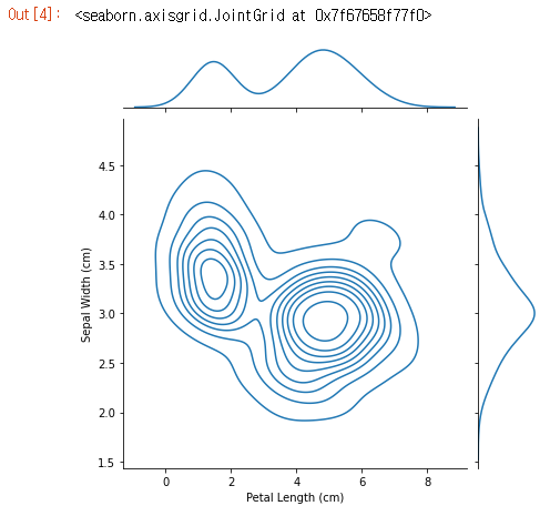
- 그림 상단의 곡선은 x축 데이터에 대한 KDE 플롯입니다(이 경우 iris_data[ ‘Petal Length (cm)’]).
- 그림 오른쪽의 곡선은 y축의 데이터에 대한 KDE 플롯입니다 (이 경우 iris_data[‘Sepal Width (cm)’]).
색상 코드 플롯(Color-coded plots)
1
2
3
4
5
6
7
8
9
10
11
12
# Paths of the files to read
iris_set_filepath = "input_data/iris_setosa.csv"
iris_ver_filepath = "input_data/iris_versicolor.csv"
iris_vir_filepath = "input_data/iris_virginica.csv"

# Read the files into variables
iris_set_data = pd.read_csv(iris_set_filepath, index_col="Id")
iris_ver_data = pd.read_csv(iris_ver_filepath, index_col="Id")
iris_vir_data = pd.read_csv(iris_vir_filepath, index_col="Id")

# Print the first 5 rows of the Iris versicolor data
iris_ver_data.head()
1
2
3
4
5
6
7
8
9
    Sepal Length (cm)  Sepal Width (cm)  ...  Petal Width (cm)          Species
Id                                       ...
51                7.0               3.2  ...               1.4  Iris-versicolor
52                6.4               3.2  ...               1.5  Iris-versicolor
53                6.9               3.1  ...               1.5  Iris-versicolor
54                5.5               2.3  ...               1.3  Iris-versicolor
55                6.5               2.8  ...               1.5  Iris-versicolor

[5 rows x 5 columns]
아래 코드에서 sns.distplot 명령을 세 번 사용하여 각 붓꽃 종에 대해 다른 히스토그램을 만듭니다. label=을 사용하여 각 히스토그램이 범례에 표시되는 방식을 설정합니다.
1
2
3
4
5
6
7
8
9
10
# Histograms for each species
sns.distplot(a=iris_set_data['Petal Length (cm)'], label="Iris-setosa", kde=False)
sns.distplot(a=iris_ver_data['Petal Length (cm)'], label="Iris-versicolor", kde=False)
sns.distplot(a=iris_vir_data['Petal Length (cm)'], label="Iris-virginica", kde=False)

# Add title
plt.title("Histogram of Petal Lengths, by Species")

# Force legend to appear
plt.legend()
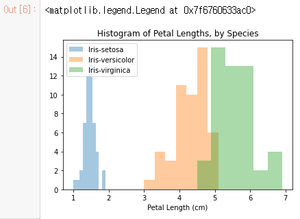
이 경우 범례는 플롯에 자동으로 나타나지 않습니다. (모든 플롯 유형에서) 강제로 표시하려면 항상 plt.legend()를 사용할 수 있습니다.
sns.kdeplot을 사용하여 각 종에 대한 KDE 플롯을 만들 수도 있습니다. 다시 말하지만, label=은 범례의 값을 설정하는 데 사용됩니다.
1
2
3
4
5
6
7
# KDE plots for each species
sns.kdeplot(data=iris_set_data['Petal Length (cm)'], label="Iris-setosa", shade=True)
sns.kdeplot(data=iris_ver_data['Petal Length (cm)'], label="Iris-versicolor", shade=True)
sns.kdeplot(data=iris_vir_data['Petal Length (cm)'], label="Iris-virginica", shade=True)

# Add title
plt.title("Distribution of Petal Lengths, by Species")
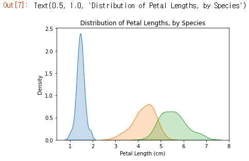
플롯에서 볼 수있는 한 가지 흥미로운 패턴은 식물이 두 그룹 중 하나에 속하는 것으로 보이며, Iris versicolor와 Iris virginica는 꽃잎 길이에 대해 비슷한 값을 갖는 반면 Iris setosa는 그 자체로 범주에 속합니다.
데이터 시각화에 어떤 그래프를 사용해야하나?
데이터 이면의 스토리를 가장 잘 전달하는 방법을 결정하는 것은 쉬운 일이 아닙니다. 따라서 이를 돕기 위해 차트 유형을 세 가지 광범위한 범주로 나눴습니다.
- Trends Trends는 변화의 패턴으로 정의됩니다.
- sns.lineplot 꺾은 선형 차트는 일정 기간 동안의 추세를 표시하는 데 가장 적합하며 여러 선을 사용하여 둘 이상의 그룹에서 추세를 표시 할 수 있습니다.
- Relationship 데이터에서 변수 간의 관계를 이해하는 데 사용할 수있는 다양한 차트 유형이 있습니다.
- sns.barplot 막대 차트는 다른 그룹에 해당하는 수량을 비교하는 데 유용합니다.
- sns.heatmap 히트 맵을 사용하여 숫자 표에서 색상 코드 패턴을 찾을 수 있습니다.
- sns.scatterplot 산점도는 두 연속 변수 간의 관계를 보여줍니다. 색으로 구분 된 경우 세 번째 범주 형 변수와의 관계도 표시 할 수 있습니다.
- sns.regplot 산점도에 회귀선을 포함하면 두 변수 간의 선형 관계를 쉽게 볼 수 있습니다.
- sns.lmplot 이 명령은 산점도에 여러 색으로 구분 된 그룹이 포함 된 경우 여러 회귀선을 그리는 데 유용합니다.
- sns.swarmplot 범주형 산점도는 연속형 변수와 범주형 변수 간의 관계를 보여줍니다.
- Distribution 분포를 시각화하여 변수에서 볼 수있는 가능한 값과 가능성을 보여줍니다.
- sns.distplot 히스토그램은 단일 숫자 변수의 분포를 보여줍니다.
- sns.kdeplot KDE 플롯(또는 2D KDE 플롯)은 단일 숫자 변수(또는 두 개의 숫자 변수)의 추정 된 부드러운 분포를 보여줍니다.
- sns.jointplot 이 명령은 각 개별 변수에 해당하는 KDE 플롯과 함께 2D KDE 플롯을 동시에 표시하는 데 유용합니다.